
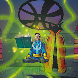
The last job I did for Marvel was ghosting 3 pages on THOR. My friend Scott Koblish was inking the book. He was in a bit of a bind and he gave me 3 pages so I helped him out. The penciller was Scot Eaton and I was really familiar with his stuff. I do like the color on this page, but hate the lettering!

3 comments:
I've seen far worse lettering (and so have you: remember that special Tokyopop job?). But I must admit that I am not a fan of the upper & lower case lettering in the dialogue balloons. That was the Marvel "style" right? bleech.
Don't get me started about that Tokyopop job. I should say that Marvel got over the upper and lower case style pretty quick!
Hi DH, can you elaborate as to why this lettering is considered yucky in comic circles?
Does it become difficult to read or is it purely an aesthetic preference?
Post a Comment